
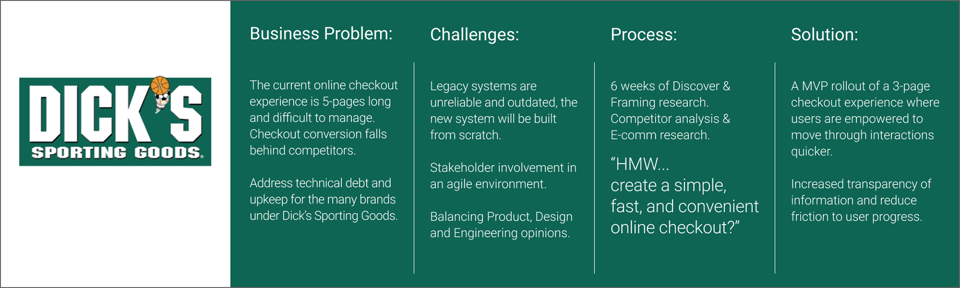
Situation:
Teams at Dick’s Sporting Goods are organized as one Designer, one Product Manager and eight to ten engineers. One of the major opportunities was to update the Online Checkout experience from legacy systems. It was determined that the current systems are broken, built with many workarounds to accommodate multiple branded websites (Dick's Sporting Goods, Field & Stream, Golf Galaxy) and dependent on 3rd party resources which led to annual technical debt. It was identified the greatest opportunity lies with creating a new experience, with a focus on a single source of truth codebase, for Online Checkout for shoppers.
Teams at Dick’s Sporting Goods are organized as one Designer, one Product Manager and eight to ten engineers. One of the major opportunities was to update the Online Checkout experience from legacy systems. It was determined that the current systems are broken, built with many workarounds to accommodate multiple branded websites (Dick's Sporting Goods, Field & Stream, Golf Galaxy) and dependent on 3rd party resources which led to annual technical debt. It was identified the greatest opportunity lies with creating a new experience, with a focus on a single source of truth codebase, for Online Checkout for shoppers.
Contribution:
I led HCD efforts, user research, and user experience design efforts on the project. The Discovery & Framing process took about six weeks to collect stakeholder goals, needs, fears and opportunities. After spending time with stakeholders, I led efforts to go into the field to understand user needs. Afterwards, the team went into a month-long synthesis and ideation phase to understand what experiences could be created and how to start with an MVP and scale in an agile way. The following areas define the many areas and iterations of work that I did during my time at Dick's Sporting Goods.
HCD Efforts:
- Worked in a "Balanced Team" approach which means that Design, Product, and Engineering work together.
- Shared the "Double Diamond" process with the team and how to accomplish Discovery & Framing with the effort of moving towards a MVP.
- Led Stakeholder Mapping, Affinity Clustering, and other HCD focused exercises and other methods to help Product and Engineering build empathy for online shoppers. I specifically followed and introduced the LUMA Institute materials and methods to my team, something that I find helped to bridge the gap and fear of design activities.
User Research:
- Conducted stakeholder interviews
- Wrote research plans, goals, and conducted end-user interviews
- Training for Product & Development to help in field research efforts including how to conduct an interview
- Documented and synthesized findings from research efforts
- Shared out observations and findings from interviews and customer intercepts
UX Design:
- Created design sketches
- Shared design sketches in formal and informal critiques with stakeholders and other UX designers within the Technology Department
- Took low fidelity mockups and static prototypes into the field for "usability testing" with users to understand where they may get lost within the experience.
- Static prototypes would often be printed oversized screens and I would simulate "touch" features. Customers always really enjoyed this kind of research!!
- Built higher fidelity and "click-through" prototypes for testing with users so they could interact on a company provided device
Outcome:
The team launched a MVP experience to 100% traffic late in summer 2019. The new Checkout experience focuses on transparency of information, providing a much welcomed improved guest experience and updated UX patterns. Reduced clicks and friction to moving forward was a goal of the redesign. The solution auto selects information when possible and shares information to help user make a purchasing decision rather than hiding relevant information behind popups and linked pages.
The team launched a MVP experience to 100% traffic late in summer 2019. The new Checkout experience focuses on transparency of information, providing a much welcomed improved guest experience and updated UX patterns. Reduced clicks and friction to moving forward was a goal of the redesign. The solution auto selects information when possible and shares information to help user make a purchasing decision rather than hiding relevant information behind popups and linked pages.
Secondary Research:
After getting stakeholders on board with the design thinking method, the real work began. Internal secondary data was sourced, analyzed, and bucketed to create a list of assumptions to test against. In parallel, external secondary research was utilized to understand the e-commerce landscape. Finally, a competitor audit was preformed to gain insight into how others are preforming similar tasks. With this information in hand, it was time to go into the field.
After getting stakeholders on board with the design thinking method, the real work began. Internal secondary data was sourced, analyzed, and bucketed to create a list of assumptions to test against. In parallel, external secondary research was utilized to understand the e-commerce landscape. Finally, a competitor audit was preformed to gain insight into how others are preforming similar tasks. With this information in hand, it was time to go into the field.
Primary Research:
Primary data collection lasted 6 weeks and included interviews with HQ employees, store associates, and many user research inputs such as interviews, card sorts, low fidelity prototypes and observations directly with customers in stores. These findings were synthesized into a user value and feasibility matrix which led to a product road map (can't be shown). What users were ultimately interested was for their online checkout experience to be simple, convenient and fast.
Primary data collection lasted 6 weeks and included interviews with HQ employees, store associates, and many user research inputs such as interviews, card sorts, low fidelity prototypes and observations directly with customers in stores. These findings were synthesized into a user value and feasibility matrix which led to a product road map (can't be shown). What users were ultimately interested was for their online checkout experience to be simple, convenient and fast.
Solution:
Some functionality added includes auto-populating as much information as possible, streamlining decision making and increasing transparency of information for users to make quick and smart decisions. By reducing the number of pages across the experience, led to positive metric results. This new design went to A/B testing and was shown, with significance, to lead to increased progression and conversions of user purchases. Although on the right path, this checkout is an exercise in iterative design and was constantly being experimented with to further improve user experience. The solution was fully responsive and compliance tested.
Some functionality added includes auto-populating as much information as possible, streamlining decision making and increasing transparency of information for users to make quick and smart decisions. By reducing the number of pages across the experience, led to positive metric results. This new design went to A/B testing and was shown, with significance, to lead to increased progression and conversions of user purchases. Although on the right path, this checkout is an exercise in iterative design and was constantly being experimented with to further improve user experience. The solution was fully responsive and compliance tested.
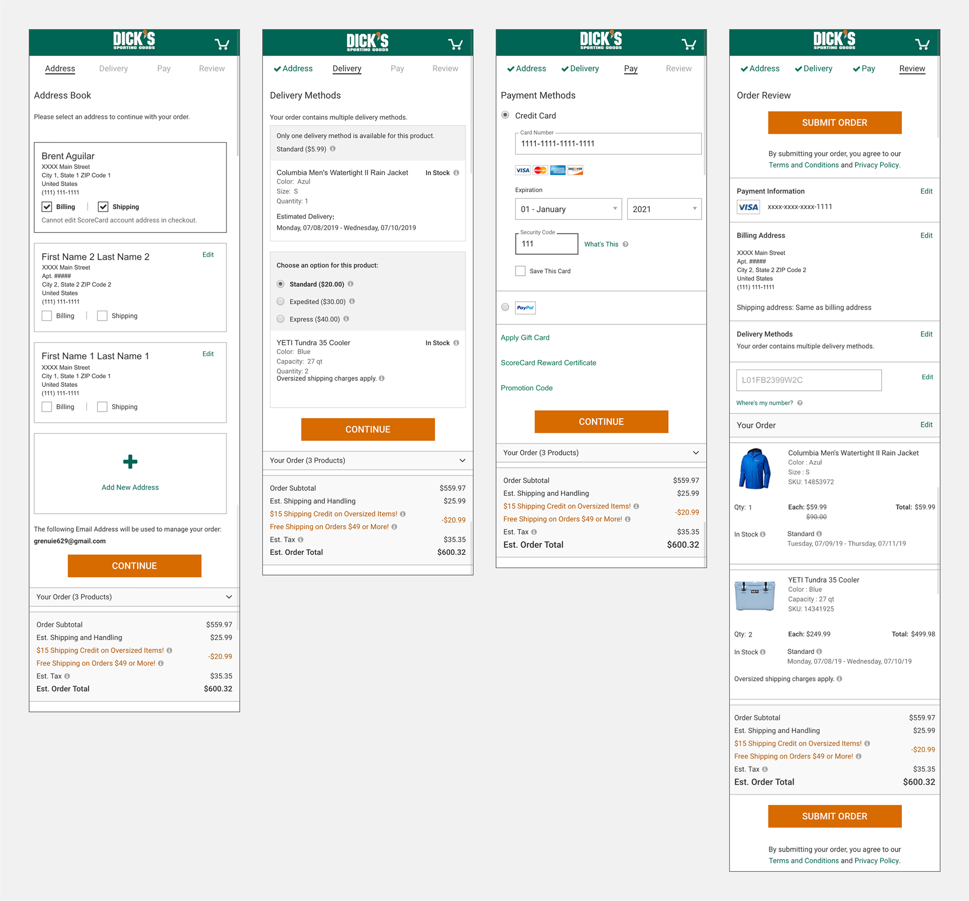
Current Experience, First Four Images (Above):
The current mobile checkout experience is 5 pages long, these are the first four pages of interaction.
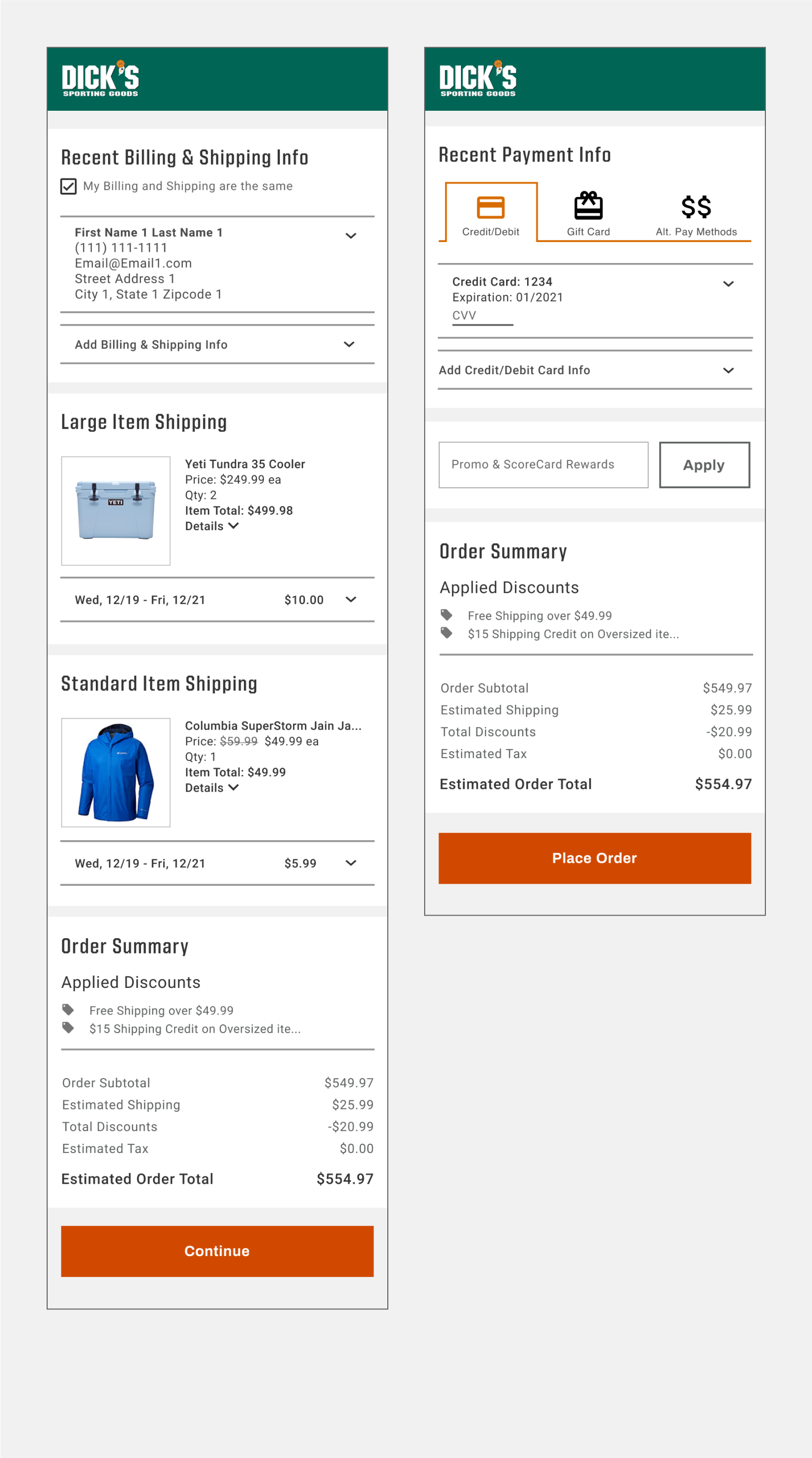
Design Implemented, Final Two Images (Above):
4 pages of information input were paired down to a two page MVP. The new experience is responsive and exceeds user expectations of being simple, convenient, and fast.
The current mobile checkout experience is 5 pages long, these are the first four pages of interaction.
Design Implemented, Final Two Images (Above):
4 pages of information input were paired down to a two page MVP. The new experience is responsive and exceeds user expectations of being simple, convenient, and fast.
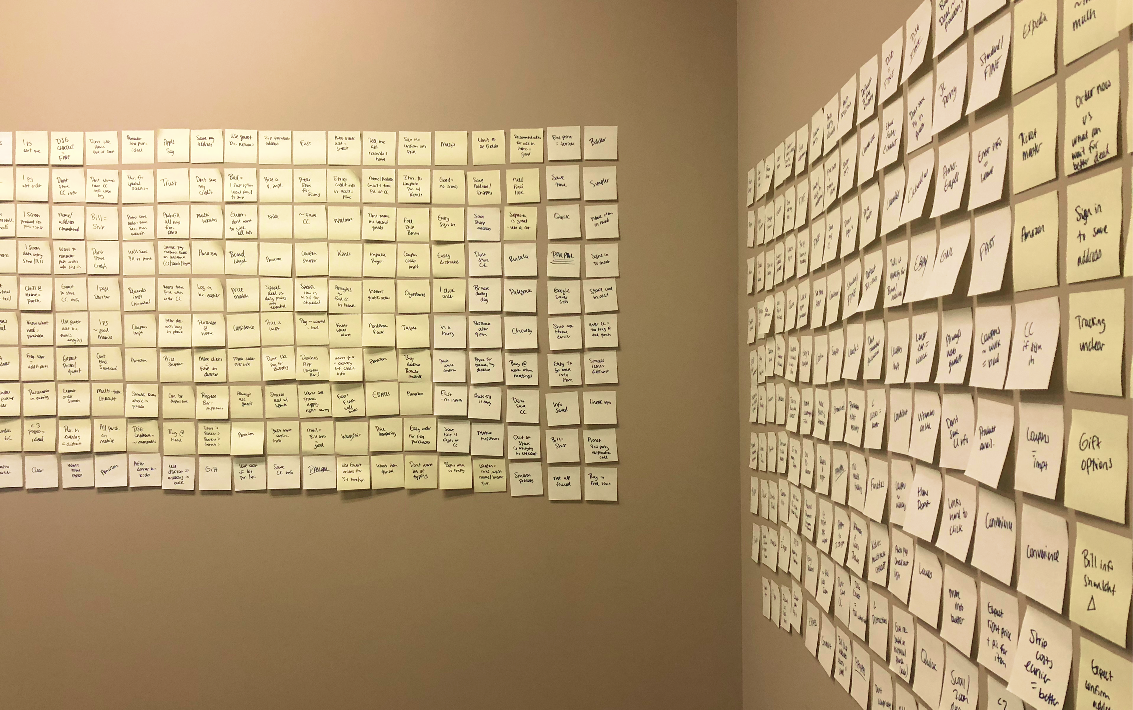
Testing Designs in the Field:
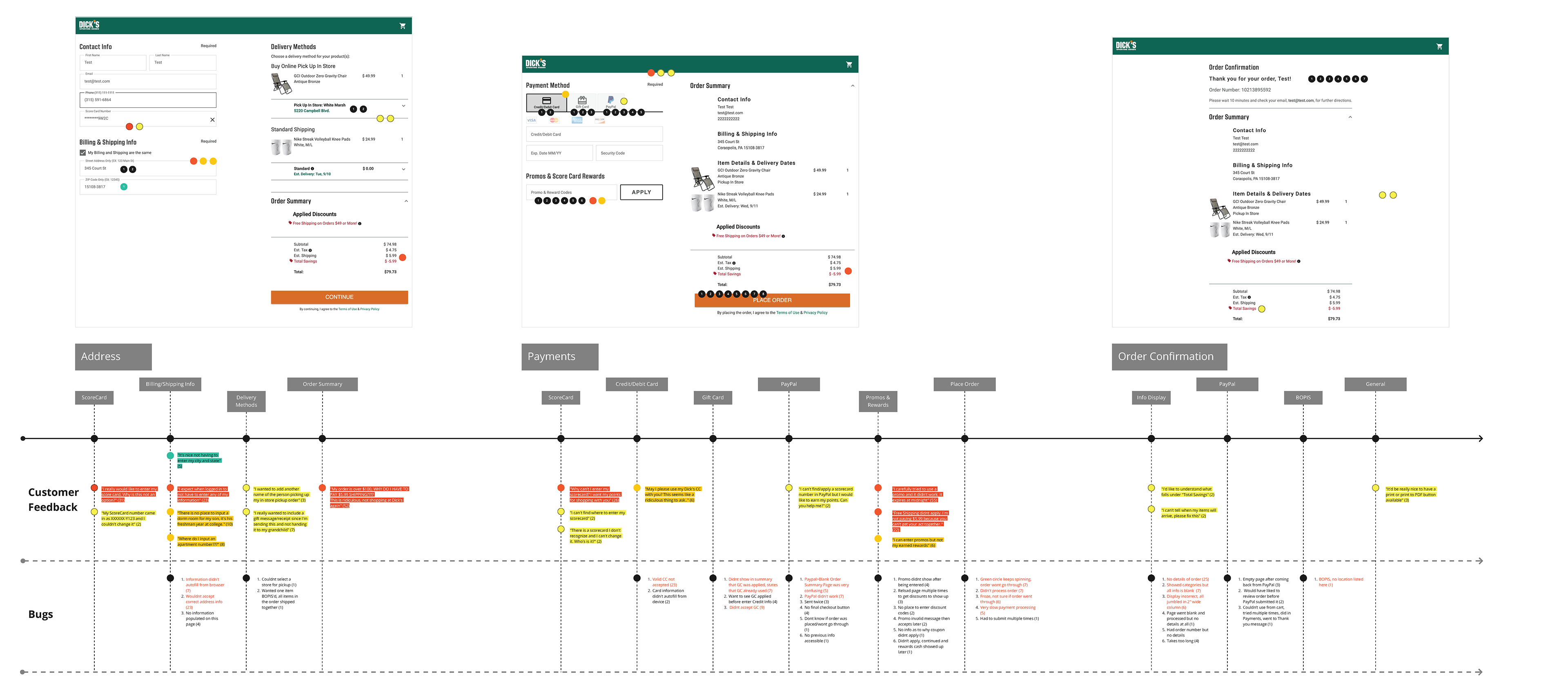
Designs were launched with a survey link within the experience. Information was collected over the course of 2 weeks. Over 150 surveys were submitted which answered long form questions. The 150 surveys were organized and accounted for approximately 500 pieces of unique information. The information was synthesized and classified into "Customer Feedback" and "Bugs". The Customer Feedback section was categorized according to the pages it referenced as well as color coded to show severity of the feedback. These findings were shared with the team and leadership and worked into the road map for relevant MVP implementation needs.
Designs were launched with a survey link within the experience. Information was collected over the course of 2 weeks. Over 150 surveys were submitted which answered long form questions. The 150 surveys were organized and accounted for approximately 500 pieces of unique information. The information was synthesized and classified into "Customer Feedback" and "Bugs". The Customer Feedback section was categorized according to the pages it referenced as well as color coded to show severity of the feedback. These findings were shared with the team and leadership and worked into the road map for relevant MVP implementation needs.
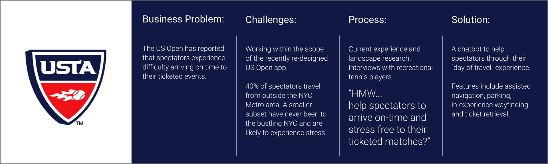
Situation:
This project was the output of consulting work with an agency in Baltimore, MD. The opportunity came from the United States Tennis Association to help improve the US Open’s experience. As an avid tennis player, it was much to my excitement to help others travel to such an exciting event. As someone who also gets frustrated when I do not know where I am going or arriving late to an event I knew there was a fantastic opportunity to improve a user’s day.
I was responsible for the field research, prototyping the design and testing the examples above with users to understand what features would best help them arrive on time and with peace of mind to their ticketed event.
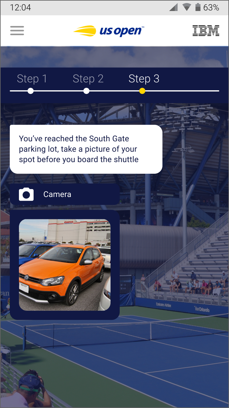
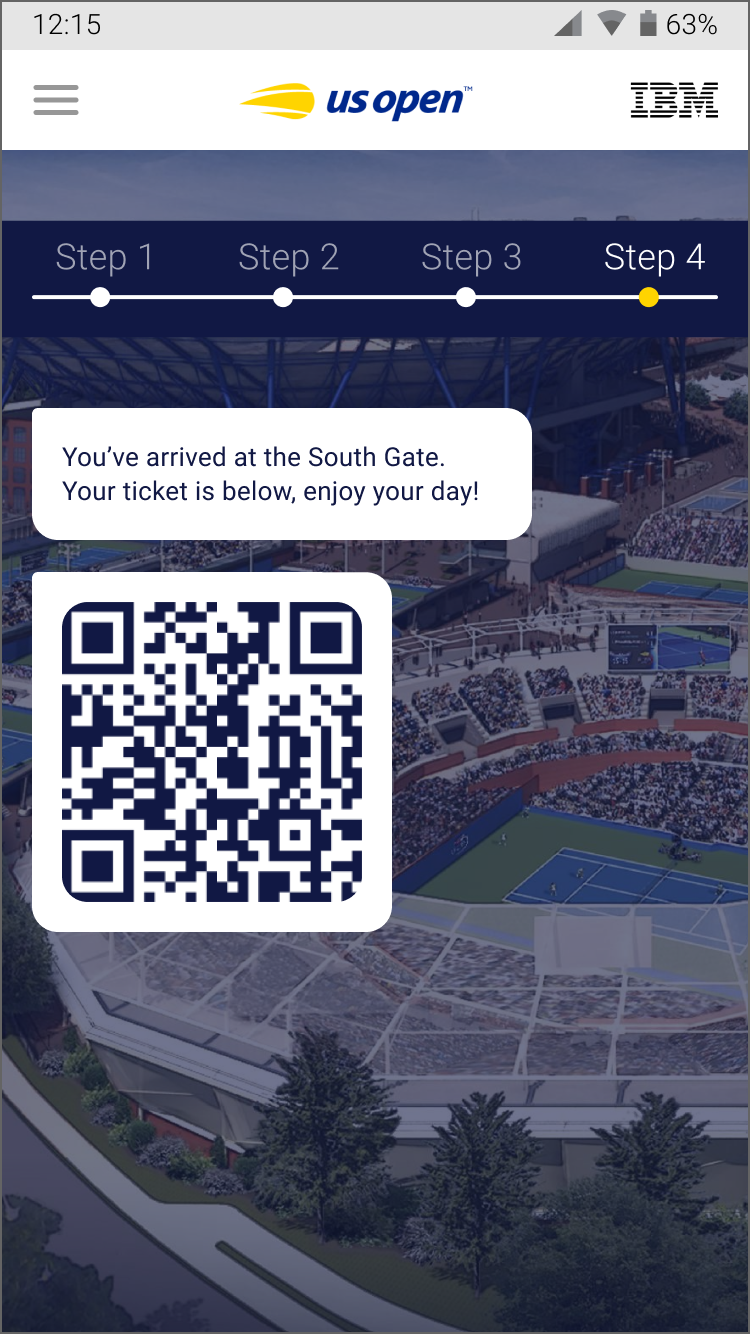
Series of Images:
The USTA was interested in assisting visitors at the US Open by updating their mobile app map experience, but it was identified that the map experience was not the issue. Rather, it was the experience before even getting to the grounds that was the most difficult journey for users across the board.
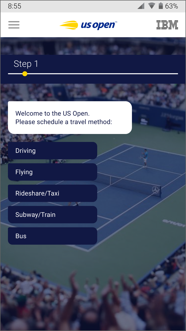
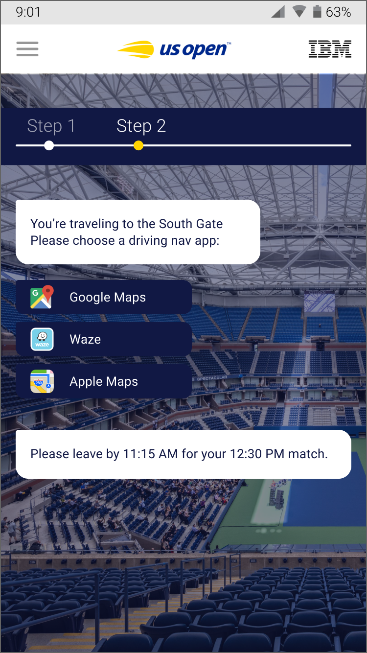
The screens provided insight into the traveling journey of someone who is driving from New Jersey, one of the highest visitor starting points, to see their match later that day.
The USTA was interested in assisting visitors at the US Open by updating their mobile app map experience, but it was identified that the map experience was not the issue. Rather, it was the experience before even getting to the grounds that was the most difficult journey for users across the board.
The screens provided insight into the traveling journey of someone who is driving from New Jersey, one of the highest visitor starting points, to see their match later that day.